
westgate
The Graphic Design of


the turn of
the century
At the beginning of 2024, I thought I had my entire year planned out. The plan, study Graphic design full-time, but after the first day of classes, I knew that wasn’t going to happen. I gave it a week and dropped out. New plan, look for a different course, and maybe freelance in the meantime. Two weeks later. A notification on my Apple Watch during one of my retail shifts, “Erin Mackellin: I’m production designing a film set in 1999, and I need some assistants. Are you interested?” Hallelujah.
I was instantly connected to Adrian Ortega’s second feature ‘Westgate’ after hearing the importance Melbourne’s Western suburbs played in its story. Being born and raised in the west myself, and a Footscray City Films graduate, I couldn’t wait to get started on pre-production with Production Designer Erin Mackellin. Erin and I studied film together, and both have a love for a good retro aesthetic. Our pre-production journey consisted of many Library meeting rooms and op shops all around the western suburbs. What did 1999 look like for this struggling single mother?, Erin’s attention to detail and passion for this project were contagious. Tasked with creating all the graphics for a vast array of props, I took a look back at my childhood, searching through my house to find real, authentic 90s inspiration. The stereotypical 90s aesthetic was full of Bright colours, bold fonts, and straight-to-the-point advertising. The 90s told it like it was. I love it, but at a point, I realised that to be accurate, some of these props would have to be a little ugly, and with “Westgate” being set right at the turn of the century, I had fun adding a couple of nods to the scare tactics that came along with the looming millennium. Although a lot of these props are just background noise to this beautiful story, they are also two 90s babies from the west trying to create something as authentic as possible.


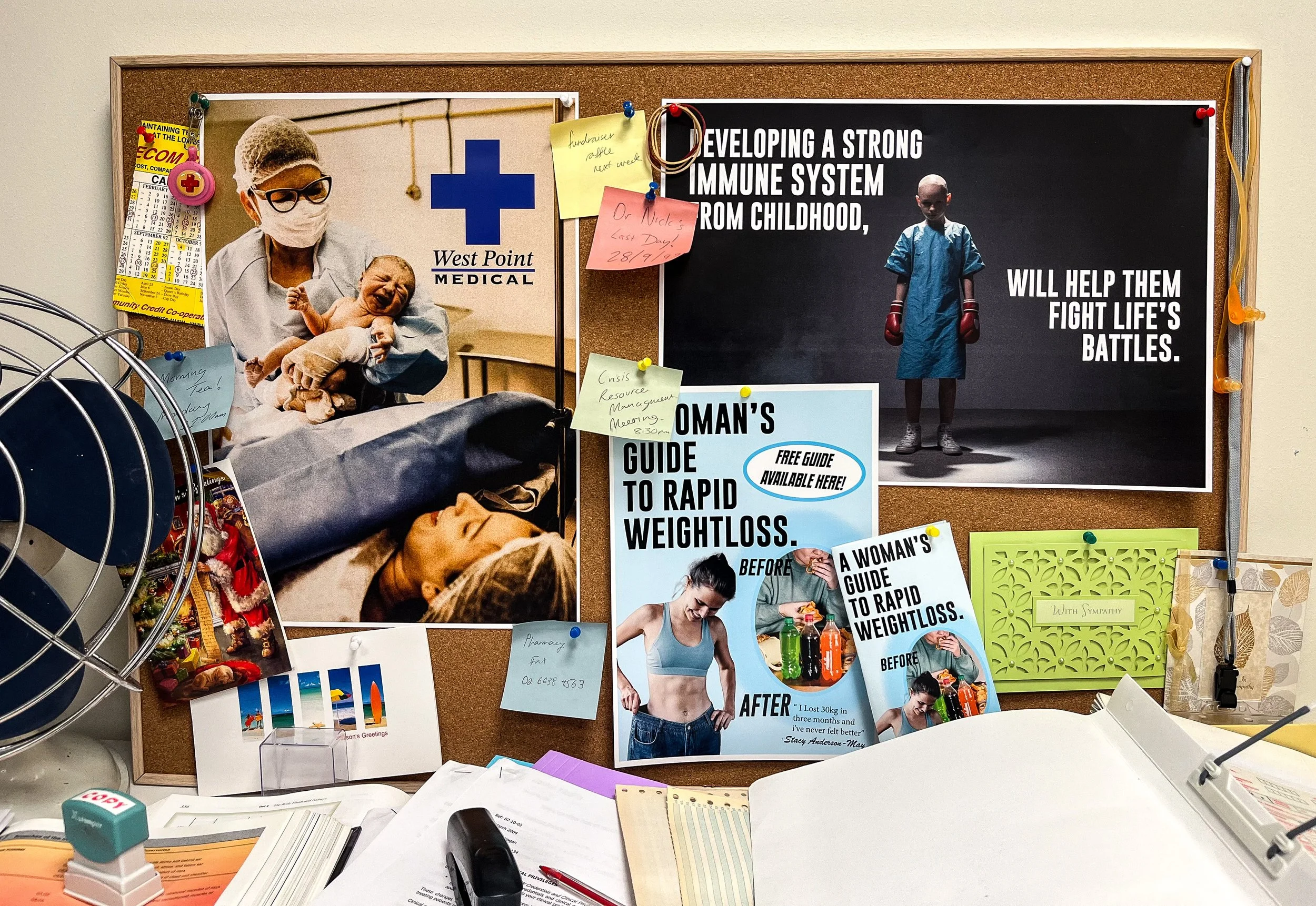
west point
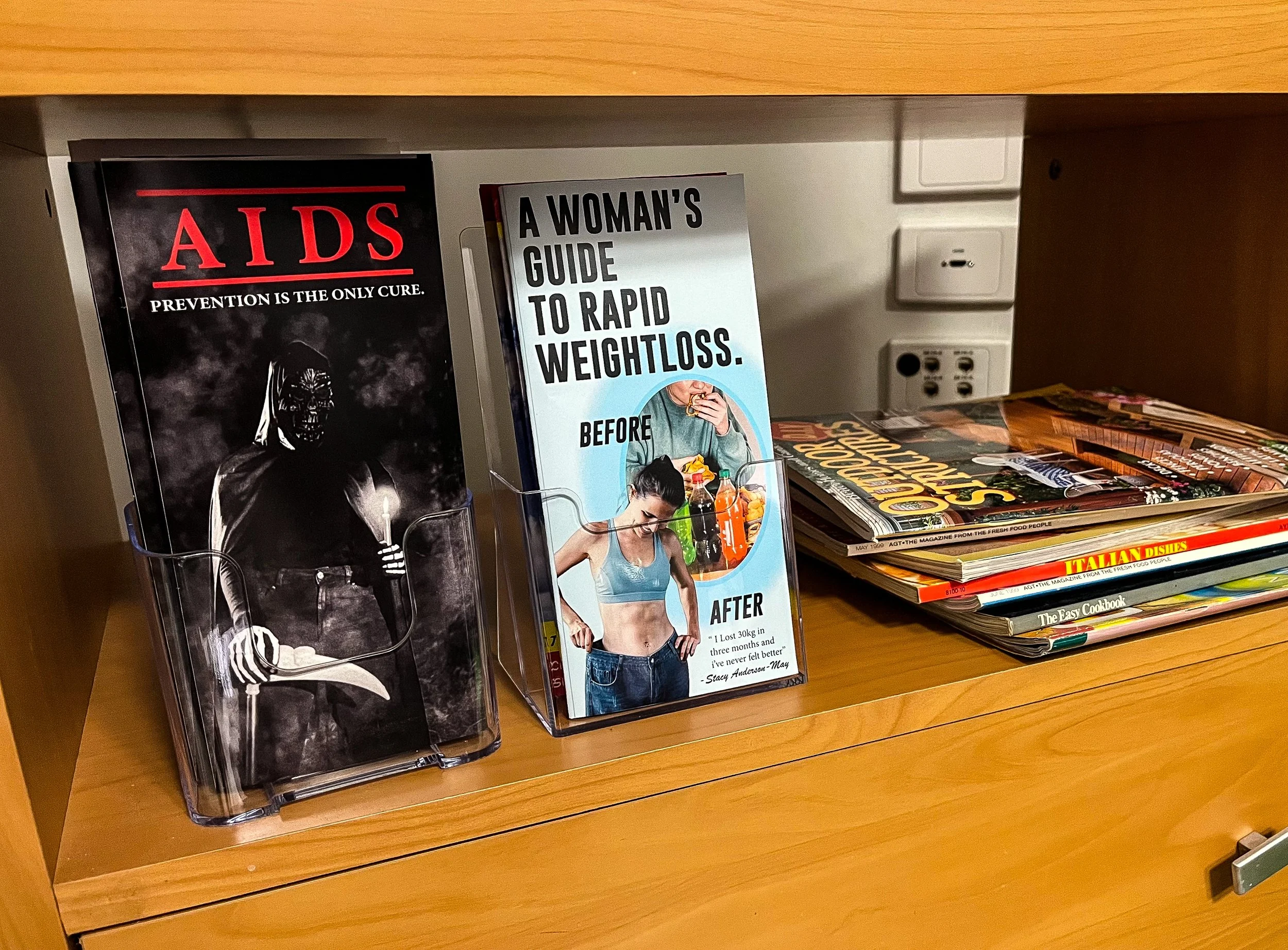
medical
When I started researching medical advertising in the ’90s, my first thought was: Wow, that would not fly nowadays, which then became my personal brief when creating all the medical advertising found in Westpoint Medical.
You’re too fat, don’t eat that, prevention is the only cure — the ’90s didn’t sugar-coat anything. And with supermodels more popular than ever, a new level of diet culture followed. While many focused on vain diet fads, the AIDS epidemic of the 1980s continued to shape ’90s culture. Australia famously used imagery of the Grim Reaper preaching prevention as the only cure — a harsh, but true example of the scare tactics used throughout ’90s medical advertising.


support
australia
For my entire childhood, my dad worked at different Centrelink branches all around the western suburbs. I have a lot of memories of the bland uniforms and the interesting characters he would deal with day to day, so I already had a lot of inspiration when designing Westgate’s counterpart, “Support Australia.”
I drew a lot of aesthetic inspiration from the many shades of grey Microsoft Word 95 brought to our documents, while also noticing a common theme of happy imagery juxtaposed with strong messaging in the advertising of the time.
The ‘Make a Wish’ poster below features an authentic 1999 photo from my 3rd birthday party.


